Have a Question?
Builder Documentation
To Start
- Select A Page to edit via the dropdown under edit pages.
- This will open the page and builder.
- You will see the module panel slide up and a grid on the page.
- Drag and drop the module to the grid to add modules.
Toolbar
On the Builder Toolbar, you will find these buttons:
- Plus Button = To open module panel.
- Responsive Styling = Customize styling on Desktop, Tablet Landscape, Tablet Portrait, or Mobile.
- Undo/Redo = Undo/redo (you can use keyboard shortcuts Cmd+Z and Cmd+Shift+Z).
- Import = Import Builder content from a data file, existing posts, or pages.
- Export = Export the Builder content (export will generate a ZIP file which can be imported later using the import option).
- Layouts:
- Load Layout = Import pre-designed Builder Layouts to the current page.
- Save as layout = Save current layout to use on another page.
- Duplicate This Page = duplicate the page along with the Builder content.
- Page Custom CSS = Allows you to add custom CSS to the specific page.
- Interface Options = Choose your interface options such as enable hover mode and right-click menu.
- Help = Click to open the Builder Tutorial video lightbox and view the keyboard shortcuts.
- Save = Save the Builder content.
- Revisions = Revisions allow you backup and restore your previous layout. To access revisions, click on the arrow button beside the Save button. You can select to save or load a revision.
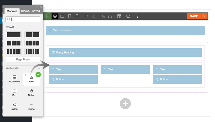
Adding Modules
- Click on the plus (+) icon found on either the top left of the toolbar or in the last row, to open the module panel.
- To add modules, you can drag & drop module to the canvas area or click on the green plus (+) button in the top right corner.
Row Options
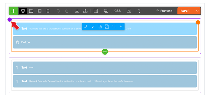
To access the row options:
- If you have hover mode enabled, just hover over the row action button (the small purple dot). To enable/disable hover mode, go to the top toolbar > Interface Options, then toggle the “Hover Mode” switch off.
- If you have hover mode disabled, click the row action button or click any where on the row, then click the row button on the action breadcrumb.
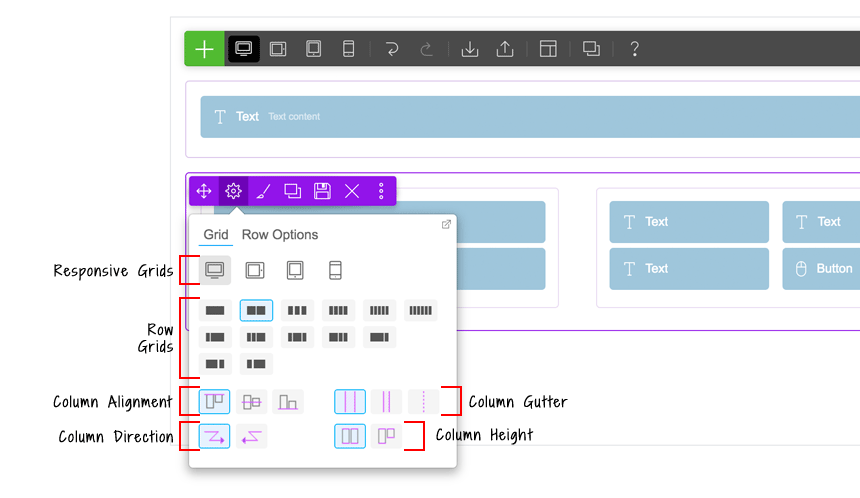
On the row action, click on the gear icon to trigger the row option dropdown menu. The row option dropdown has these options:
- Responsive Grids: To have a different grid on desktop, tablet, and mobile: first click the device icon, then click the row grid icon.
- Row Grids: You can also set the column arrangement on mobile or tablet.
- Column Alignment: Set modules in the entire row to top, middle, or bottom alignment .
- Column Direction: Set column float direction either from left-to-right or right-to-left.
- Column Gutter: The spacing/gap between columns.
- Column Height: By default, all columns within the row are full height. You can change it to auto height which means the height of the column will vary depending on the content inside the column.
On the row option dropdown menu, click the “Row Options” tab to see more options:
- Row Width:
- Default = Row background and row content area is within the container width.
- Boxed = Row background will be fullwidth, but the row content area will be within the container width.
- Fullwidth = Both row background and row content area will be fullwidth completely.
- Row Height:
- Default = Row height varies depending on the content inside the row.
- Full Height = Row will be 100vh (viewport height) and the content inside will be by default middle aligned vertically.
- CSS Class: Add additional custom CSS classes.
- Row Anchor: Add row anchor for scrollTo anchor feature.
- ID Name: Add ID name for Sticky Scrolling feature.